Originally published in July, 2008
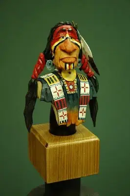
“Finally got this warrior painted this morning. Turned out real well. I just love painting these guys. I have a habit of repeating beading patterns but thats okay. I tried to be a little more creative on his shirt by using a few other colors to make the buckskin a little more colorful. The background color is ….Buckskin! I then used Yellow Ochre and some Red Iron Oxide to highlight it. Finally, I used Midnight Blue to paint the top half of the shirt.
–
If you want to know why I think my colors flow together so well is that I paint the figure just as it would be painted in real life. By that I mean I paint the entire face or shirt with the correct colors as though I wasn’t going to add any additional colors. By painting the Blue over the top of the Buckskin it allows that lower color to influence the upper ones just as it would in real life. Same goes for the face. A good example of that is when I paint a Negro. I paint him as a white person so he has the same colors and then color over that with dark umber. If I had only painted the umber the flesh would look flat and lifeless.”
Comments welcome.
